2023

Government Redesign

Team: Anne Mauldin
Tools: Figma, Miro, Google Suite, Adobe Illustrator, Photoshop
Timeline: Three weeks
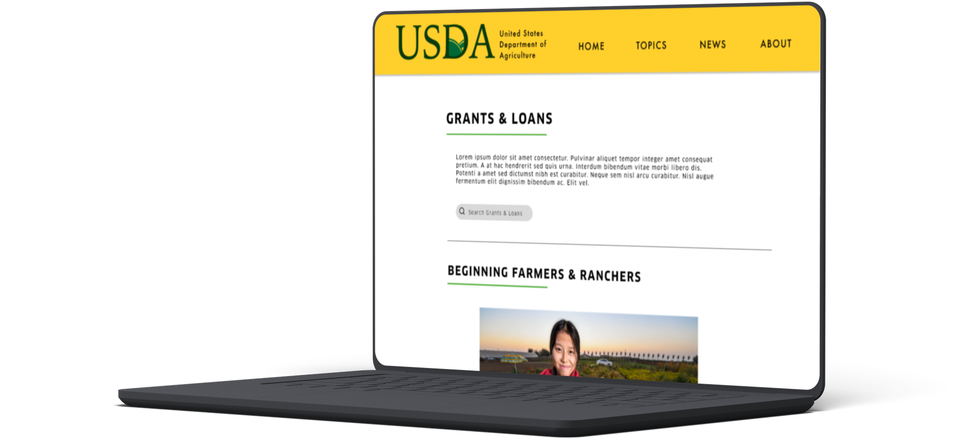
This sprint was a practice in site organization, and government sites are notorious for being an overload of information. I chose the USDA because they have a large offering of grants and loans, but they’re currently scattered all over the website. For my redesign, I took a large overview of the site to simplify and streamline its assistance programs, so users can more easily browse available programs.
Brand Positioning
CURRENT BRAND
Informative
Direct
Regulated
Doesn’t feel unique from other gov sites
Bland stock photography
Easy to read
NEW BRAND
Friendlier
Easier to understand
Approachable
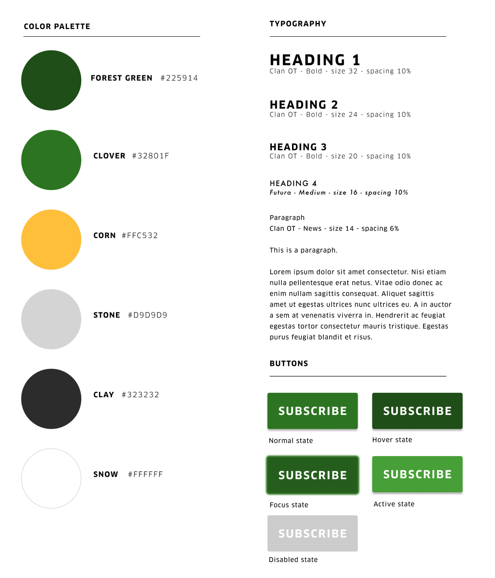
Earthy tones
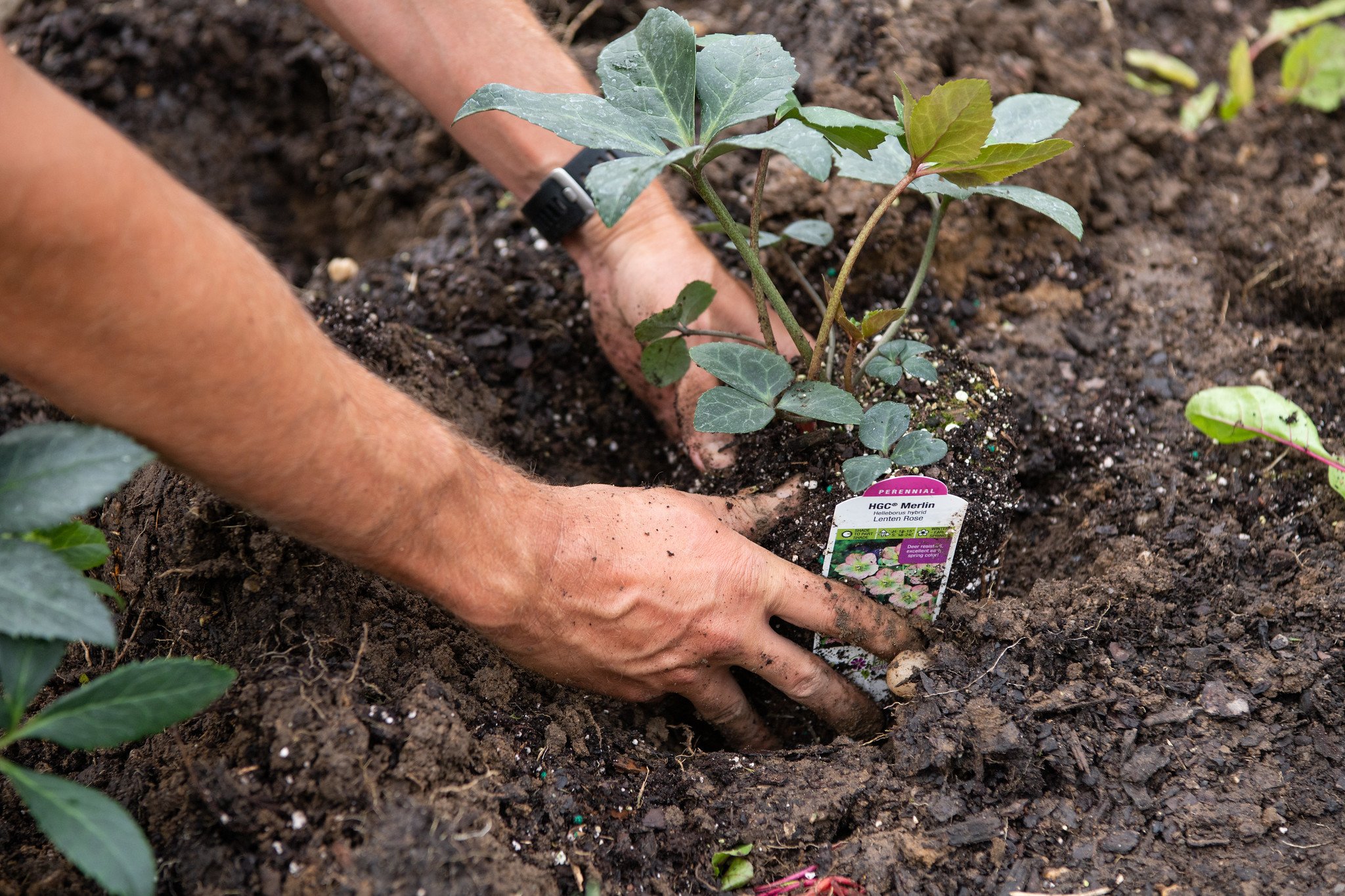
High quality photography/video
Focus on people
The United States Department of Agriculture helps American agricultural producers and consumers find trusted resources, educational material, disaster relief, and monetary assistance by providing informative instructions and clear outlines for seeking those resources and offering assistance as it pertains to food and agriculture.
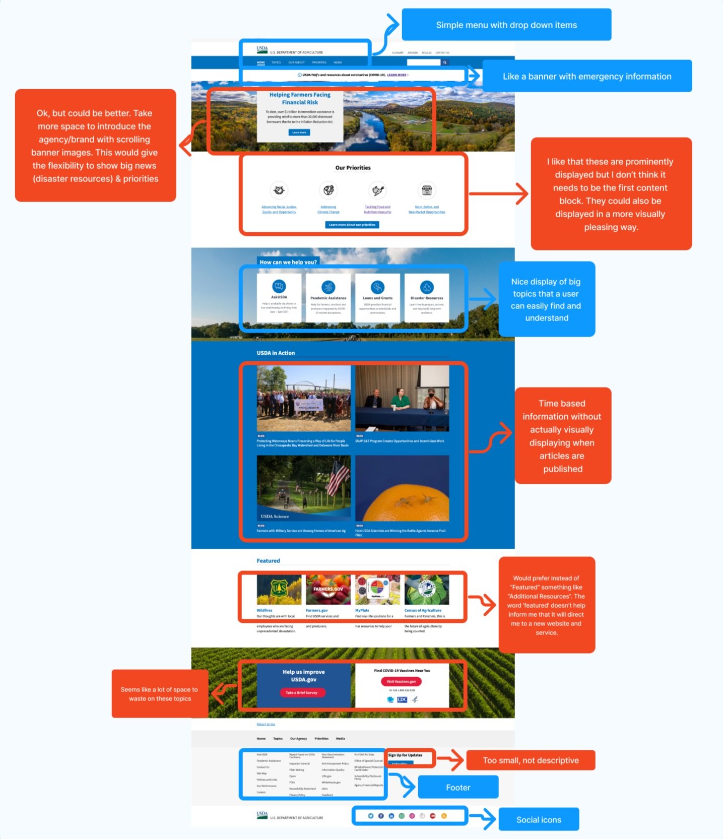
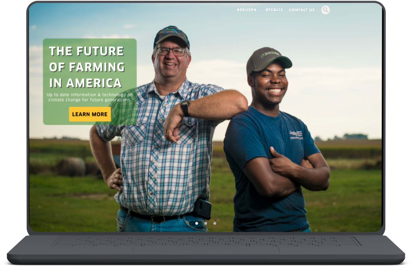
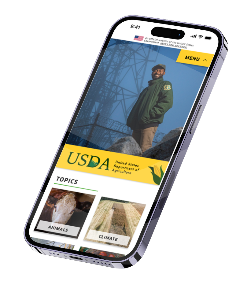
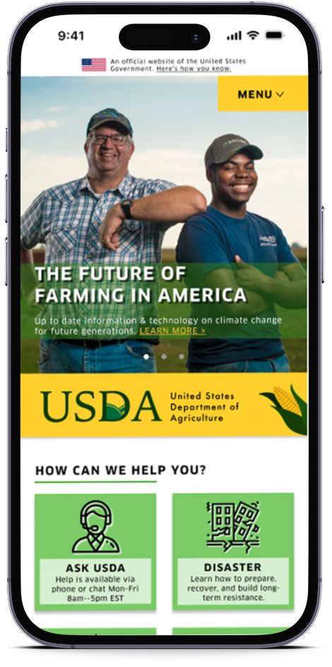
Current homepage: government blue, lack of focus on the human element, spacing and hierarchy issues
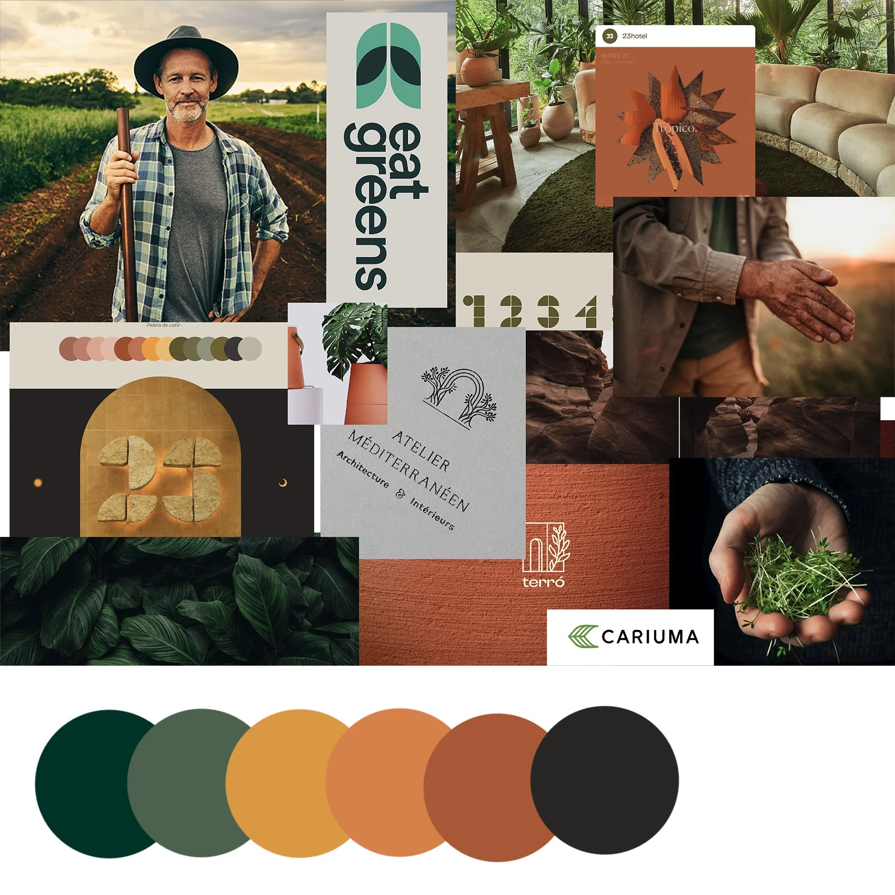
The redesign will focus on bringing personality and story to the brand, supported by earthy colors and more relaxed font types.
User Insights
Tasking users with finding a variety of grants and loans supported my prediction that the organization of the website is cumbersome.

“There are too many menu items to quickly find what I need.”
“Took me to another site without telling me”
“Took too long to find what I was looking for”
“Should be able to search for user specific grants & loans”
Site Map
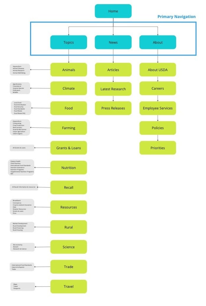

After two rounds of card sorting and user testing the primary and secondary navigation, I restructured and simplified the layout.
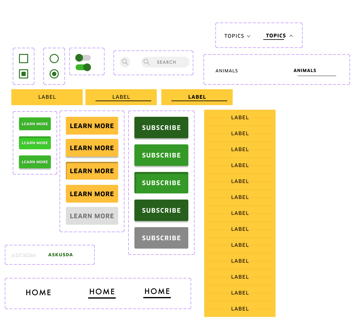
Wireframe
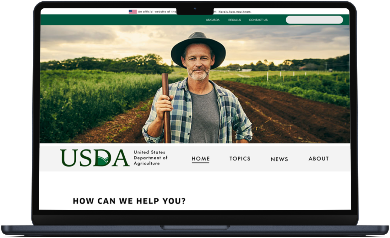
My feedback from user tests was really positive. They liked how friendly the feel was and thought the navigation was easy and intuitive.
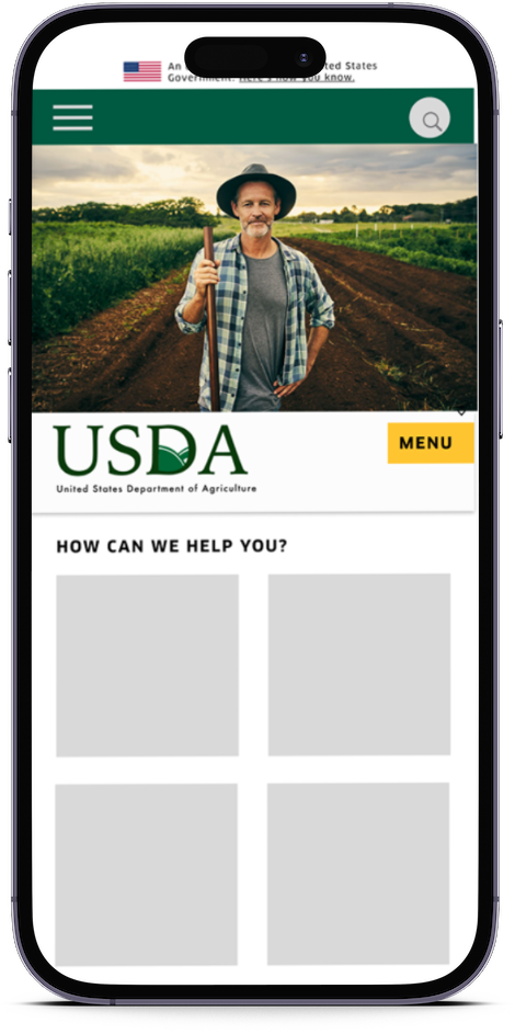
Negatives: make spacing wider on buttons, logo and image too large and take too long to load. Menu on mobile is in an odd spot.
Prototyping

I learned a lot doing high-fidelity prototyping. Starting with the mobile design brought issues with my initial design to light, and solving for the desktop was a challenge.