2023
Non-Profit Redesign
Team: Anne Mauldin, Chris Eldert, Luke Hall, Ian Evarts
Tools: Figma, Miro, Google Suite, Adobe Illustrator, Photoshop
Timeline: Three weeks
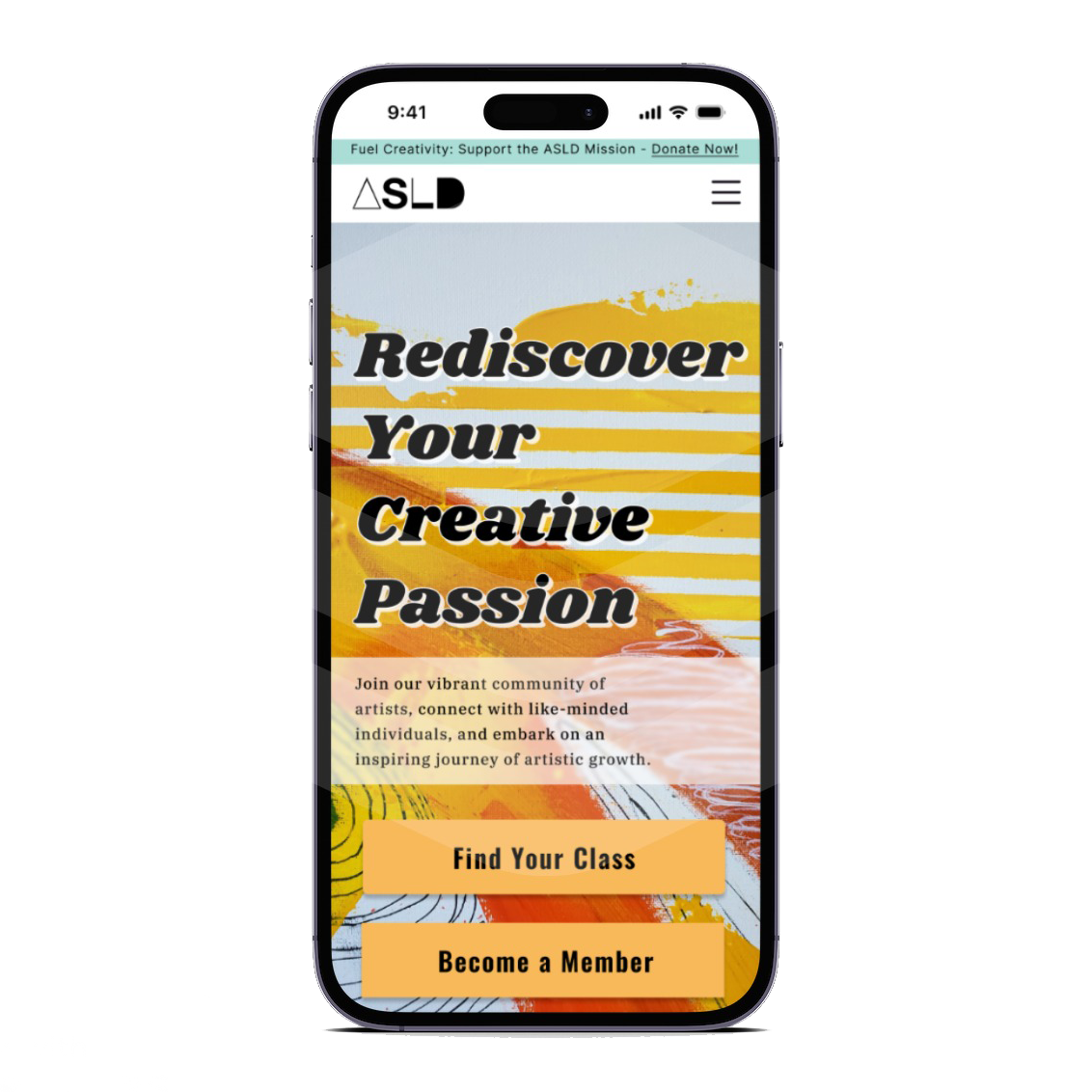
My part in this group project was taking the lead on design direction and project management. I chose the images and color palette, along with deciding on the basic layout of the website, which was heavily influenced by user feedback on the hierarchy of information they wanted to obtain from the site.
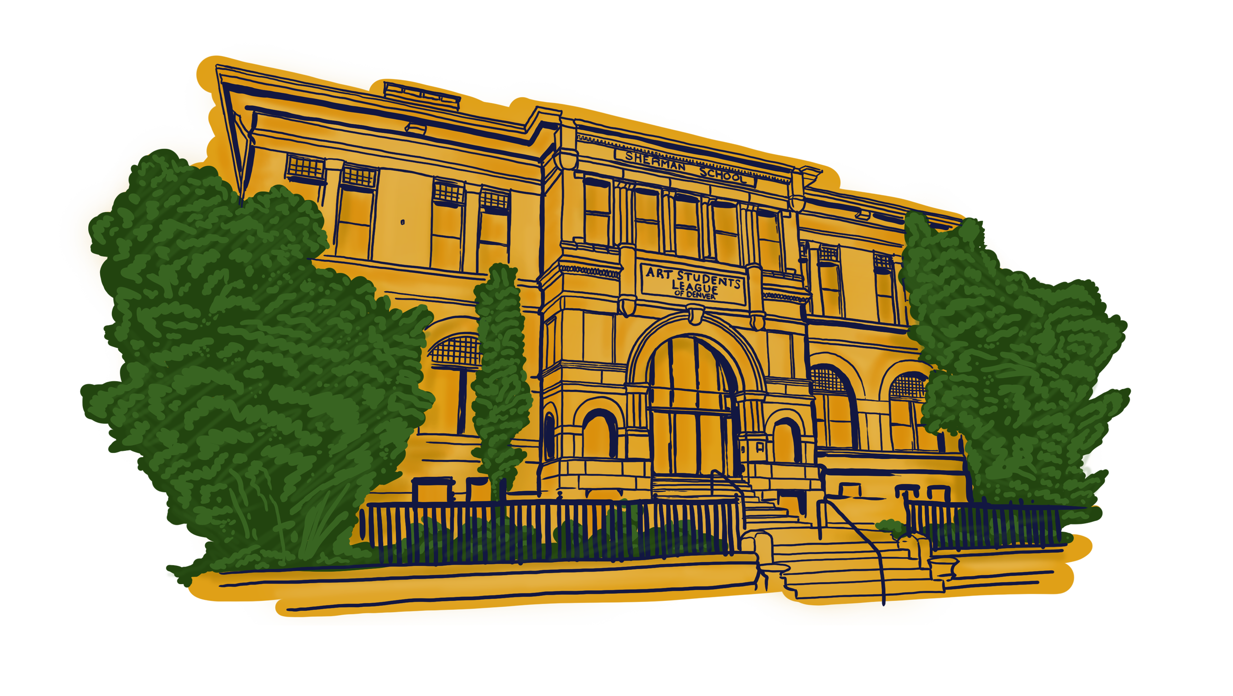
Since 1987, the non-profit Art Students League of Denver (ASLD) has helped artists in Denver by providing them with opportunities to learn and grow. They support people of all ages and skill levels, encouraging their creativity and helping them develop their artistic talents. They enrich the local culture and bring people together through art.
“It’s just hard to navigate, the courses specifically, and that’s the most important part of their site.”
THE PROBLEM
The current ASLD website is difficult to navigate and discouraging for those looking to reconnect with art and find a supportive community. It’s not responsive for mobile, and takes too long to perform basic functions.
THE SOLUTION
A redesign will make it easier for people to reconnect with art, find a supportive community, and navigate the site effectively. I predict that better usability will result in increased funding through class sign-ups, event promotion, and donations.
User Insights
Users wanted to prioritize class info with cost, skill level, course logistics, and instructor information
Users found the current site to be cluttered, lacking hierarchy, and a clunky sign-up flow
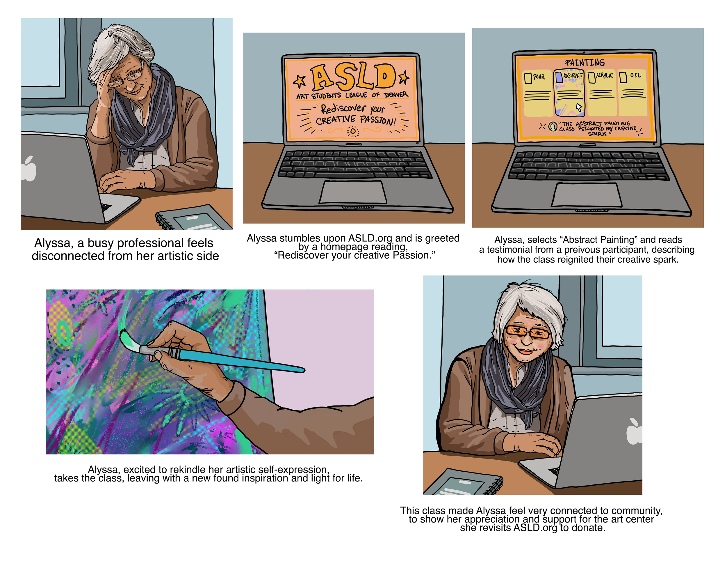
Storyboard
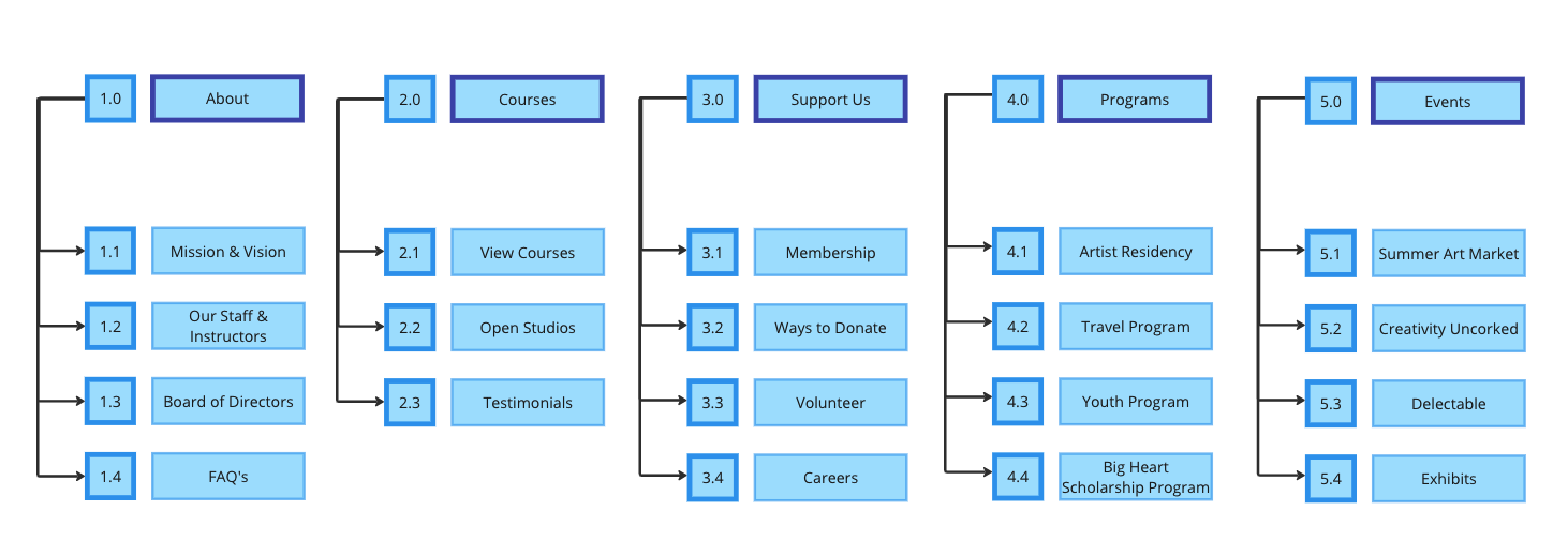
Site Map
After Heuristic Evaluations and user interviews, our group felt like the best path forward included reorganization of the site map. We timed our original user tests, citing that it took an average of two minutes for our users to find a summer ceramics course.
The original site was split into two functions managed separately: the main site and class registration. Navigating between the two sites was confusing.
Finding information for class registration was not intuitive and made for an off-putting experience.
Buttons about specific courses did not lead to their directly relevant medium.
Wireframe
After testing our wireframe we discovered that we needed to simplify the navigation and add detail pages to fully test our users’ ability to find class registration information.
TO DO:
Create a page listing all courses, with a simple filter
Create a course detail page
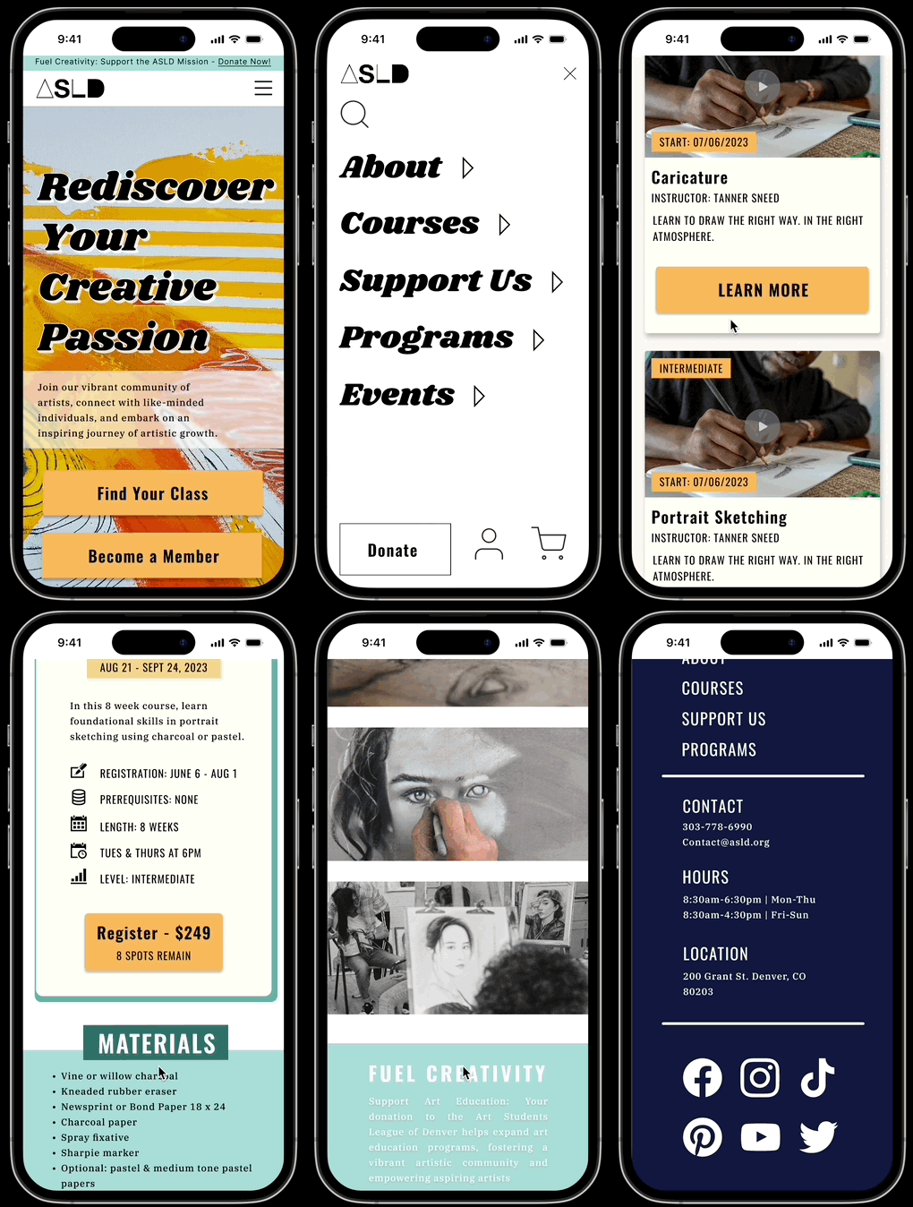
Mobile Prototype
Validating our Design
Decrease in time by 83% or 72 seconds
Seconds to Completion
100% completion
Current site: average 86 seconds
Our prototype: average 14 seconds
We hypothesize this will lead to an increase in course registration.
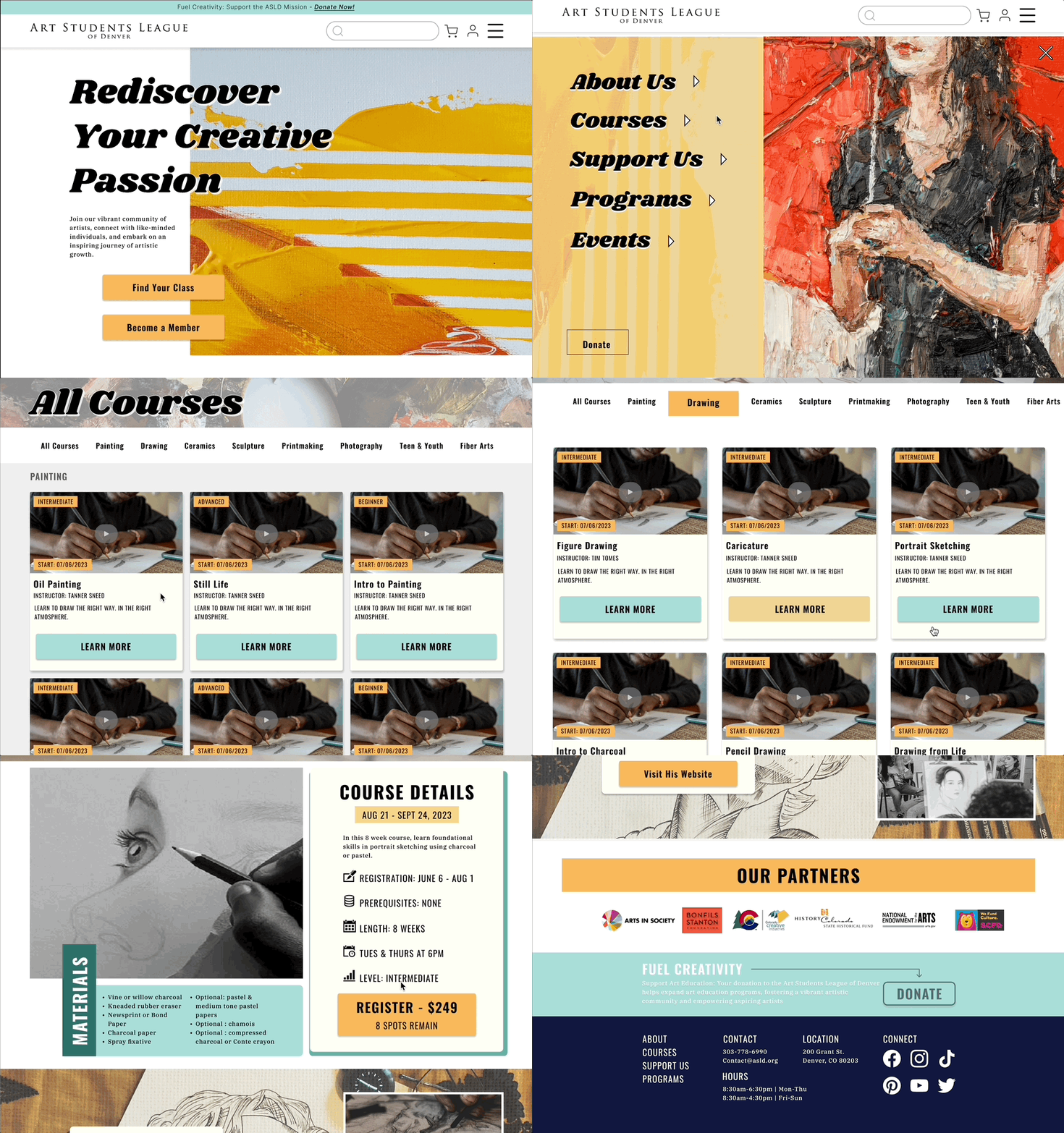
Solving for Desktop
In Conclusion, we
Took our users’ feedback into consideration at every step of the process.
Proved that reorganization of hierarchy and simplification of design would lead to a more seamless user experience.
“It has clear CTAs that are easy to execute. As a new user of the site, I have all the important information as well as next steps to take displayed on the homepage before I even scroll. The bold colors and artistic design fit extremely well with the site concept.”

